
One outfit to wear
About 15 years ago, when I was a graduate student in Biomedical Communications at the University of Toronto, the program faculty were trying to figure out how to attract more males to the program. Back in the day they only accepted eight students in each two year cohort. It was, if you paid attention to such things, more difficult to get into than medical school. Or so they said. You needed good marks, a science degree and a hefty fine art portfolio. Who has that? I do, actually. That's also why BMC'ers are such cool cats and, if we're not totally introverted wallflowers, such fine conversation at parties. In my year there was six women, myself (I am male) and Luke (also male). We apparently had "lots of guys" in our class. The year ahead of me was one for seven with Marc. The year before Marc: one. Some years there were no males, but I'm running on to illustrate my point. So they were trying to figure out how to attract more males to the program and, having a seemingly well expressed Y-chromosome, they asked me, and presumably also Marc and Luke, how they might do this. I have no idea what the others said, but I distinctly remember my response. The primary face of BMC, then as now, was the website and it was pink.
Uh, somehow make it less pink?
Before I dig a great, filthy pit in which to sit my neanderthal bottom, I don't have an extra Y chromosome. And I'm kind of a Momma's boy so I'm hardly the sexist type, or into mansplaining. And we could debate how colours are associated with genders until the sun swells up and swallows the earth. But by virtue of all the excellent medical illustrations featured on the faculty website back then, the website was almost completely pink. And soft! Dating myself a little bit, the airbrushes used to do illustrations back then had recently been retired. I'm talking about the actual airbrushes, with stencils and paint mixing and everything, not just hitting 'B' on the keyboard. Airbrushes create that lovely soft gradient so useful and prevalent in the medical illustrations of the time (and 80's fantasy van art, if you're into that sort of thing). I always thought it was weird that the airbrush was brought into the digital realm so readily.
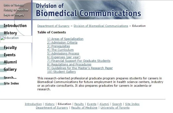
Blast from the past (courtesy of the Wayback archive), back when BMC was a Division of Surgery. Marc's sciency looking wireframe sperm header replaced a pinky surgical image. And more males applied.
"Huh", they thought. "Less pink. Hadn't occurred to me". To my credit I admitted that the colour shouldn't be a deterrent to males, really, and maybe the connection between a largely pink website and relatively few male applicants was probably reaching. But shortly afterwards the header was changed from a lovely pinky surgical image of, if I recall, a hysterectomy to a bluey wireframe computer generated image of a sperm. The cohort behind me subsequently went three for seven; Eddie, Kenneth, and Jason. Two of whom (and their clever classmate Sonia) went on to form the award winning Toronto based AXS animation. Go wireframe 3D sperm! These days it's difficult to find a lot of pink on the site. Maybe that's because of the diminished focus on surgical and anatomical images in the program in favour of more biochemical visualization and more 'imagined" concepts. Pink just isn't the first colour choice for molecules, I guess.
I'm currently selecting images for my portfolio on this very website and they are largely, gulp, pink. It has me thinking that I need to do something about that, but really, I've made hay doing anatomical and surgical illustrations and (dirty secret) I start with the same colour palette every time. Seeing all my images together, has me thinking that maybe I need to vary that palette a bit - I'm looking a bit old-school. Airbrush....
CBC Radio 3's old Flash based website circa 2003 was the inspiration for my first site. This is actually beautiful. It had nav bar that pulled out from the side, a music player up at the top and magazine style topics, all over top of a beautiful big glamour shot. This was way ahead of it's time. Does anyone else miss Flash? Is anyone else sick of the limits placed on them by modern Content Management Systems?
Websites are tough, particularly when you're doing them yourself for yourself. Yeah, you could say you have full control and can make it exactly the way you want it, it will be the ultimate expression of who you are etc. True, you can do that. and the next day you'll change your mind and hate it. I remember going through this when I set up shop the first time I freelanced in 2003. I had about six different versions designed and incomplete. Realizing I would never settle this debate myself, I simply picked a website I liked and mimicked it. It was the only way I was going to get a website up and running quickly and it worked. I had a great website. Thank you CBC Radio 3 for your inspiration.
The trouble with doing your own website is it's like dressing yourself: you wouldn't wear the same clothes every day, so why have the same website? It's like having only one outfit to wear.
To whit, I mustn't wear these pink trousers so often.